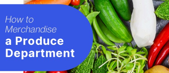
5 ways to use curated displays and color blocking to boost produce sales
August 06, 2025
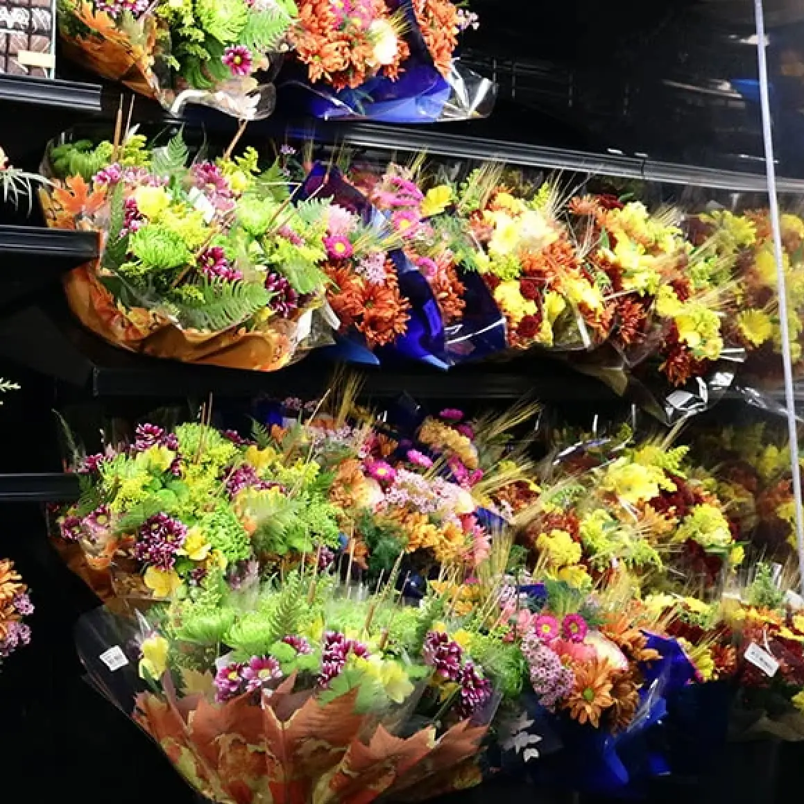
In the world of fresh produce, presentation is everything. Customers don’t just shop with their lists; they shop with their eyes. That’s where color blocking comes in: a simple yet powerful visual merchandising technique that transforms everyday fruits and vegetables into irresistible displays. When done right, color blocking doesn’t just beautify your department, it boosts sales, improves customer flow, and reinforces your store’s seasonal storytelling.
Whether you’re highlighting peak-season tomatoes or creating a festive fall spread, color blocking helps guide the shopper’s gaze, evoke emotion, and makes your produce department feel curated, not cluttered.
What is Color Blocking and Why it Works
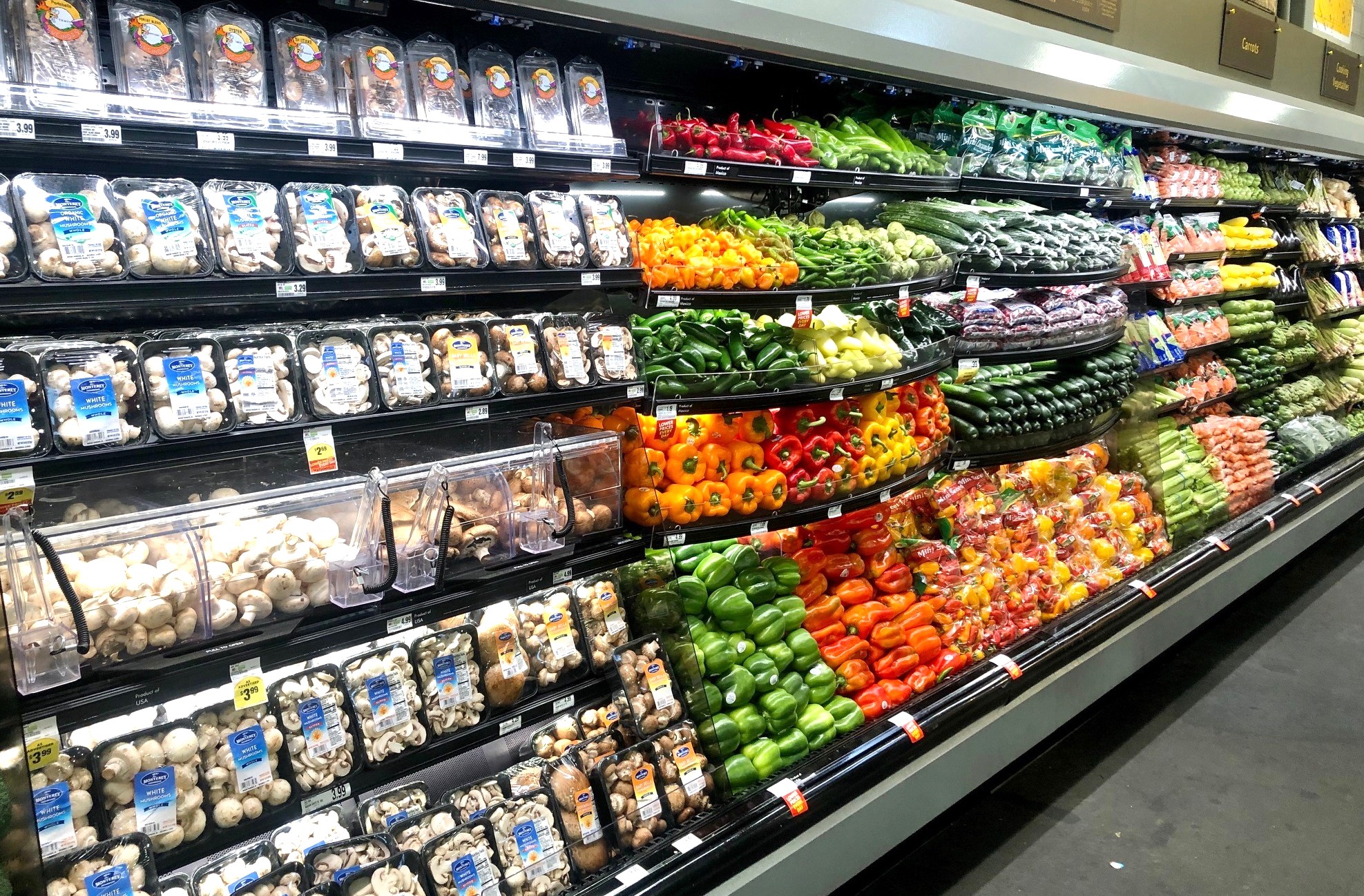
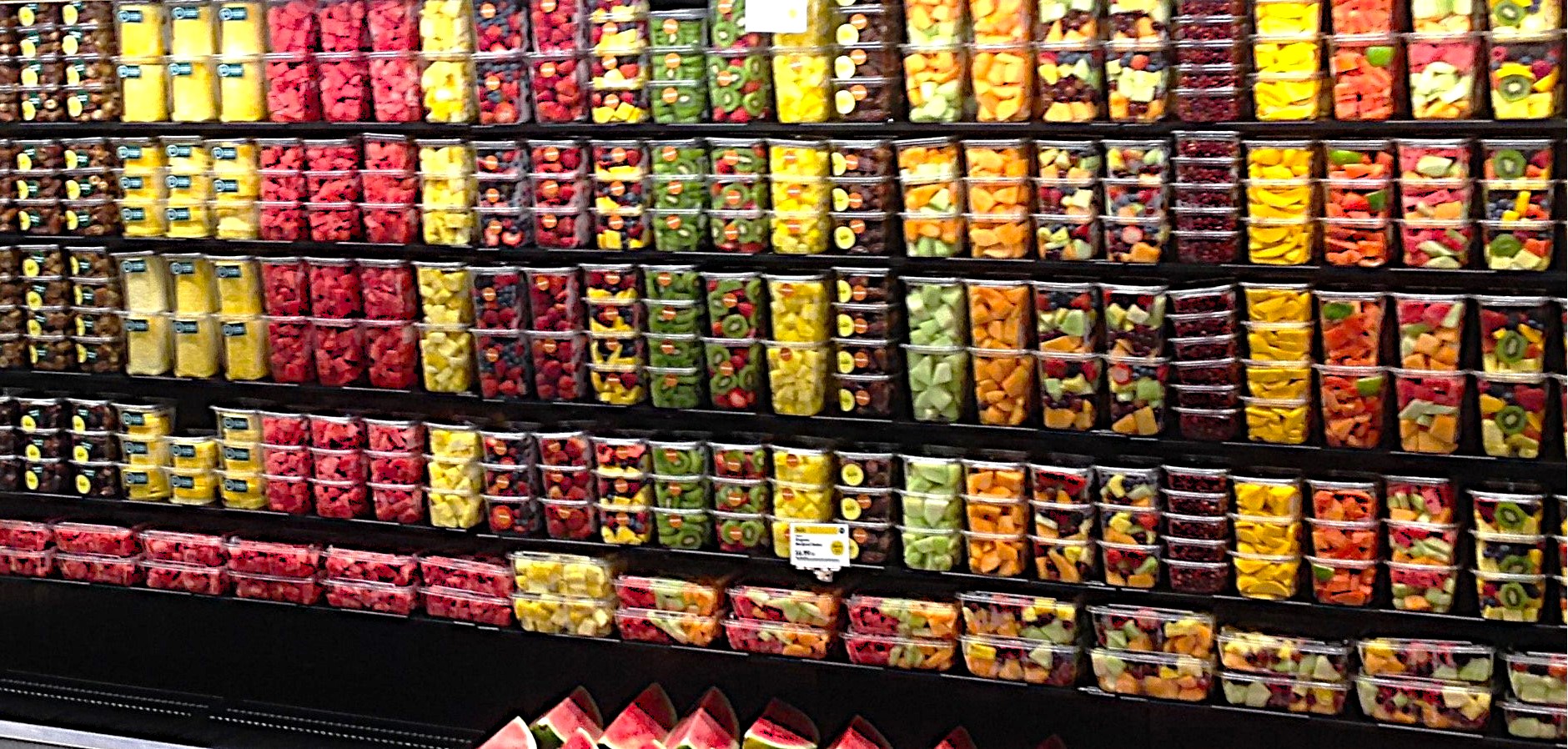
Color blocking is the practice of organizing items by color to create visually distinct sections. With the intention of creating sections of contrasting colors to draw in the eye and highlight the appeal of the items.
Color blocking is not only visually appealing, but it creates a flow which the eye can easily follow. In terms of produce and merchandising, customers can effortlessly find the type of produce they’re searching for and efficiently navigate the areas of your produce department for improved sales and time management.
When to Use Color Blocking in the Produce Department?
Color blocking is a technique that can elevate any department, but in produce it really shines! Color blocking should be used to bring attention to the assortments and varieties of produce within the department. Whether you’re showcasing items with a limited shelf life or leaning into a holiday-themed assortment, strategic color blocking guides your customers’ attention and sparks curiosity.
How to Utilize Color Blocking?
1. Know your Color Theory
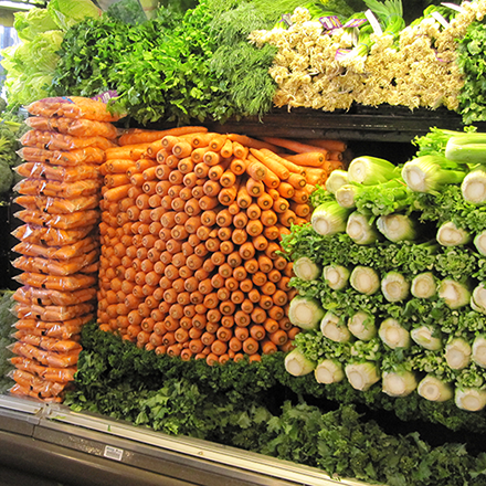
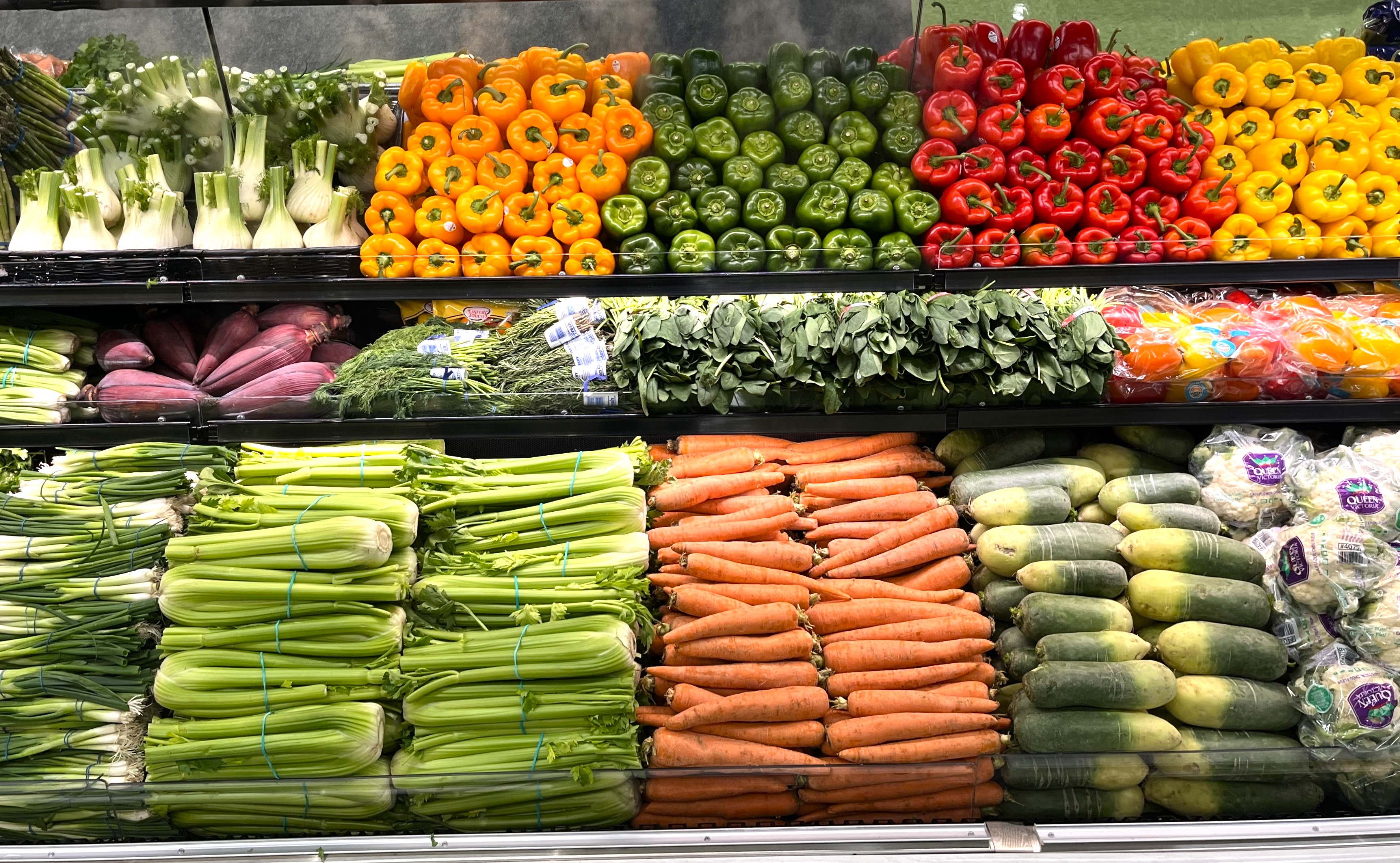
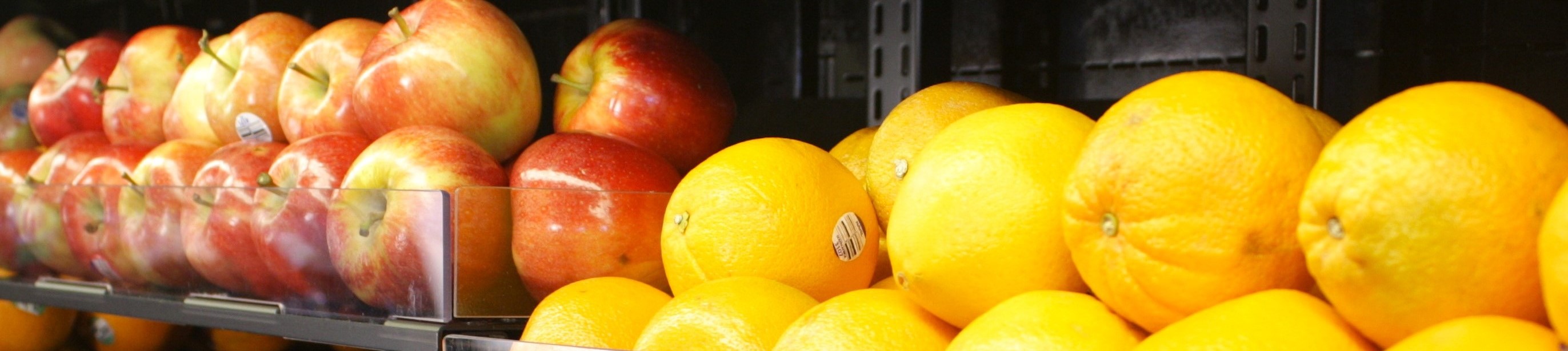
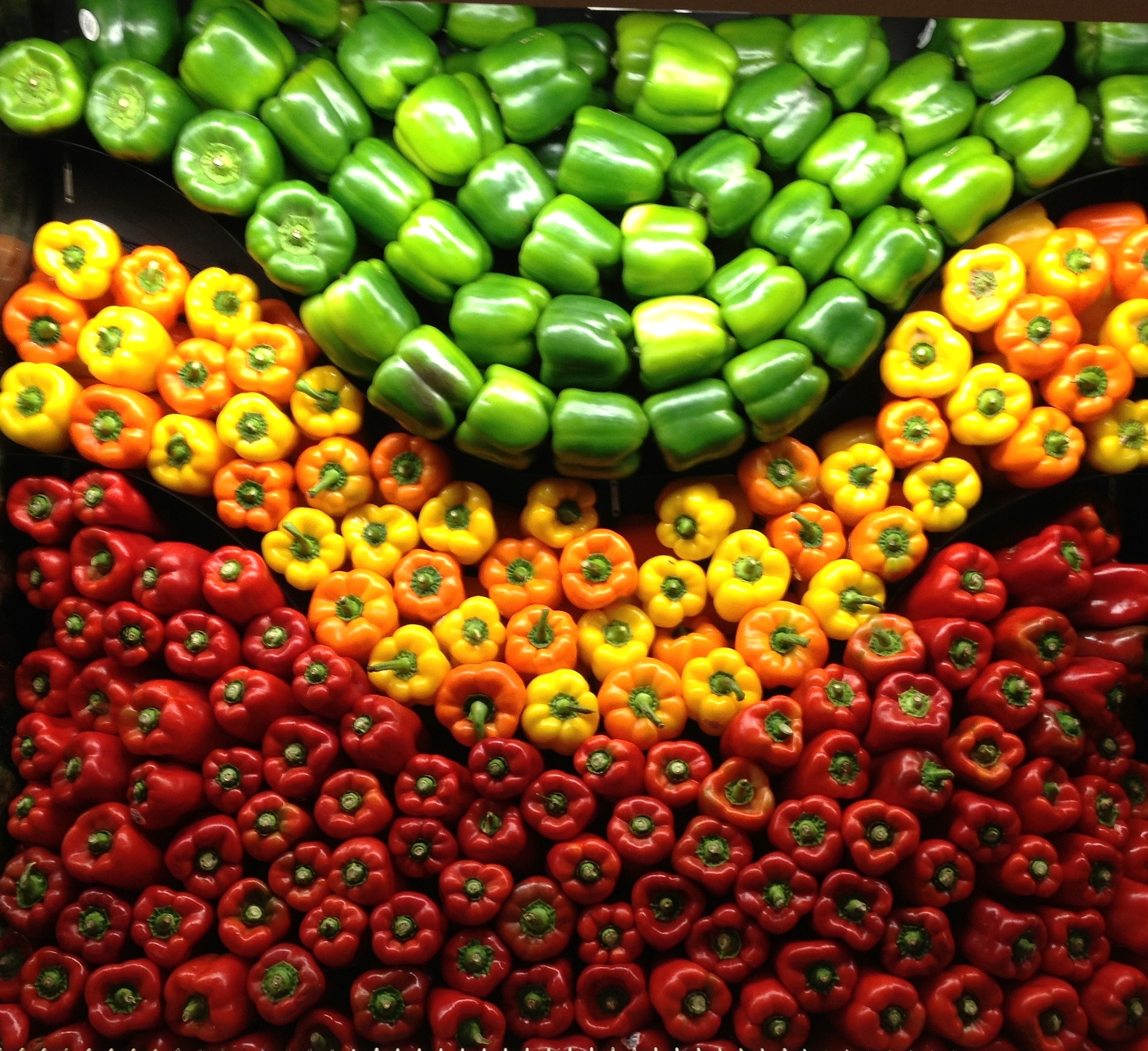
Every color tells a story. Vegetables like carrots, tomatoes, and kale add more bring distinct hues to your display. Knowing how to transition these shades into one another is a key factor in knowing how to merchandise your product.
The first thing to note is the assortment and types of harmonies in the display. In this application, complimentary and analogous color combinations would bring out the best in the produce department.
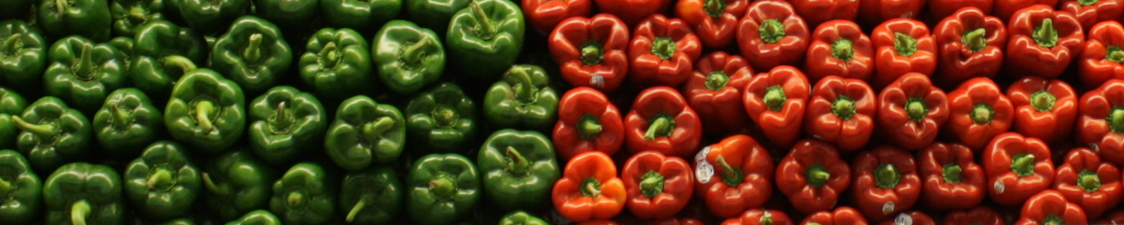
- Complimentary colors are opposite on the color wheel, like green and red.
- Analogous colors are next to each other on the color wheel, like red and orange.
When applied correctly, color theory transforms your department into a visually engaging, shoppable experience that directly influences buying behavior.
2. Tell a Story
Seasonal palettes resonate with customers on an emotional level. Holidays are one of the most prevalent examples of this. For example, July Fourth is most well known for having the color assortment of red, white, and blue. These three colors evoke pride and familiarity. It’s not just these three colors that have meaning but all the holidays that have their respective color combinations.
By applying different color combinations during their respective time frames, you’re connecting to the reasons why people gather, celebrate, and shop.
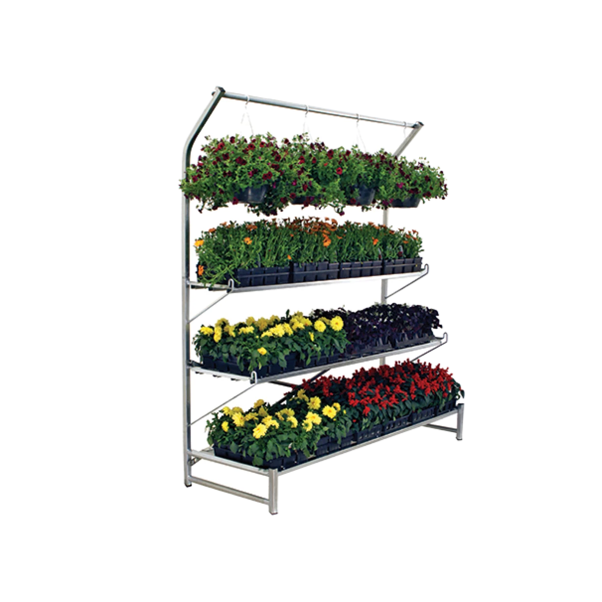
3. Color Sequencing
Produce comes in all hues and colors. The intention is to use the combination of hues to your advantage. Using your knowledge of color theory, you can place the different hues alongside your department layout to guide the customers’ eyes. Color sequencing isn’t just about aesthetics, it’s navigational merchandising.
How NOT to Use Color Blocking
1. Mixing Colors That Are Not in the Same Color Family
Unless these colors exist in a complimentary or analogous duo, mixing random colors should be avoided as it disrupts the harmonious flow within the department and can potentially draw customers away from the focus area.
However, this can be used to your advantage as well. Mixing unrelated colors can be done correctly if the goal is to draw attention. Just be sure to create intentional shapes and designs for this approach to be successful.
2. Not Paying Attention to the Subtle Color Shift
Not properly utilizing the variation in color can negatively affect how consumers view your produce department. The care in organizing produce by its color variation shows your customers the detail and care within the department, along with helping them identify the type of produce by color and shape. When every detail is intentional, shoppers notice.
The Art of Arrangement
Smart use of color in your produce department does more than tell a story, it supports inventory goals and drives engagement. From seasonal merchandising to everyday assortments, color blocking is one of the simplest ways to bring vibrancy, clarity, and purpose to your displays.
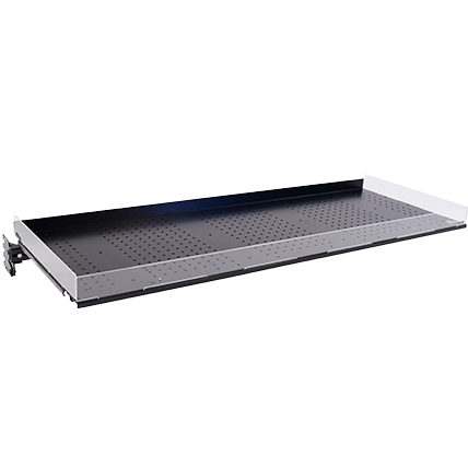
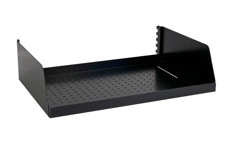
Looking for More Help Merchandising Your Produce Department?
At Carlson AirFlo, we’re passionate about produce. With the promise of presenting solutions and unique arrangements to every department everyday. Selecting the right solution for your department is part of the many services we provide, contact us to ensure you and your produce are well taken care of!
Additionally, check out our Produce Merchandising Guide on the home page of our website. Click on the image below, and simply scroll down to the Merchandising section on our home page and select ‘Produce Merchandising Guide’ from the dropdown menu in the request form.